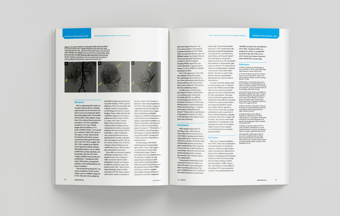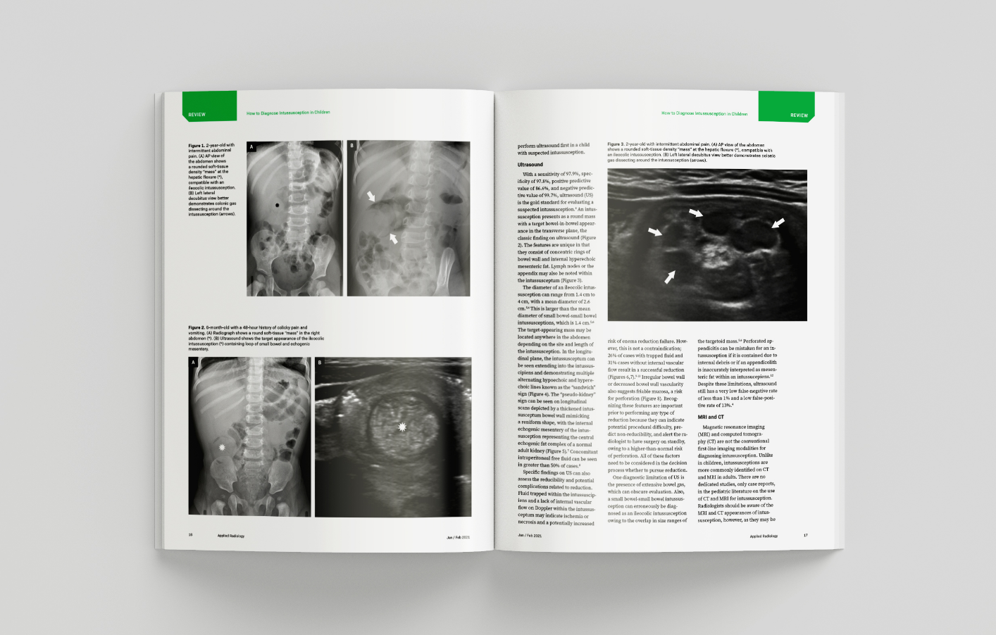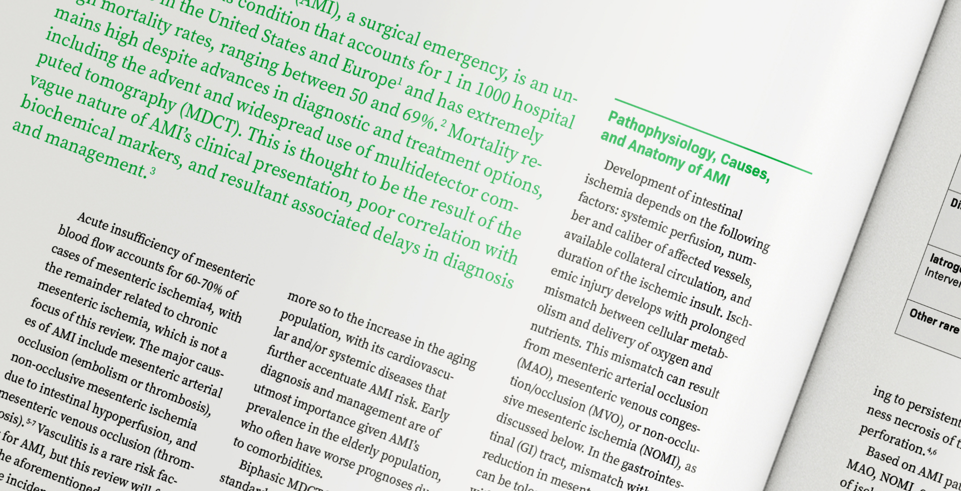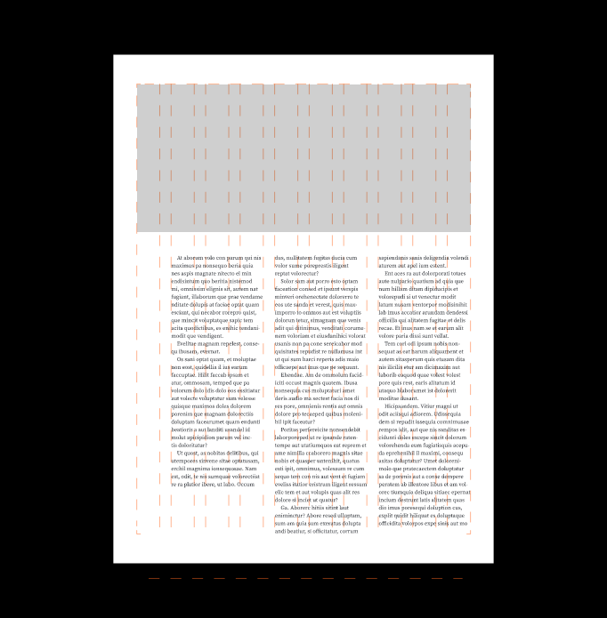
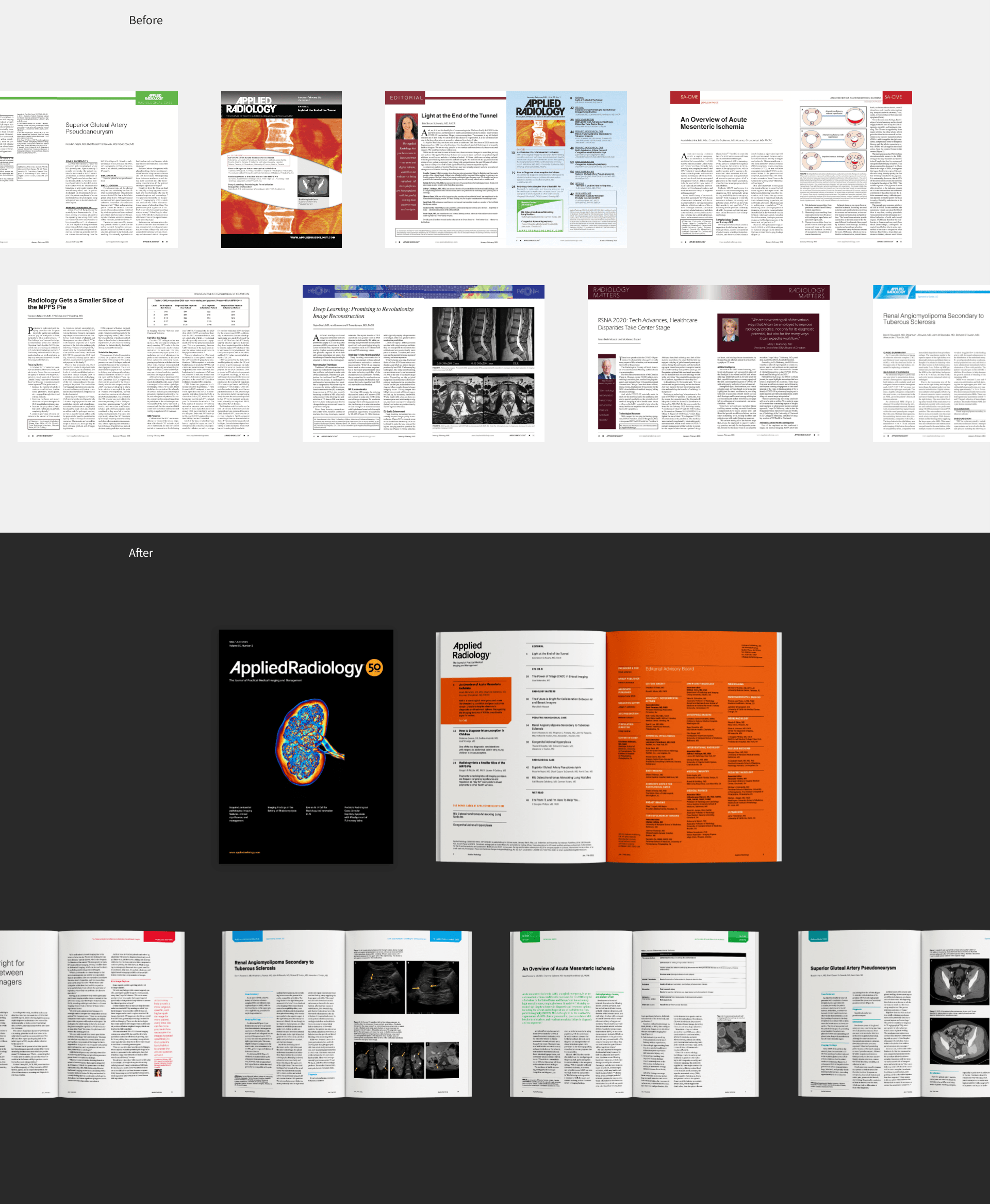
Applied Radiology is a clinical review journal for medical imaging that reaches over 50,000 radiology professionals worldwide. They wanted to refresh their visual identity so that the journal would better connect with modern readers. That’s where we came in.

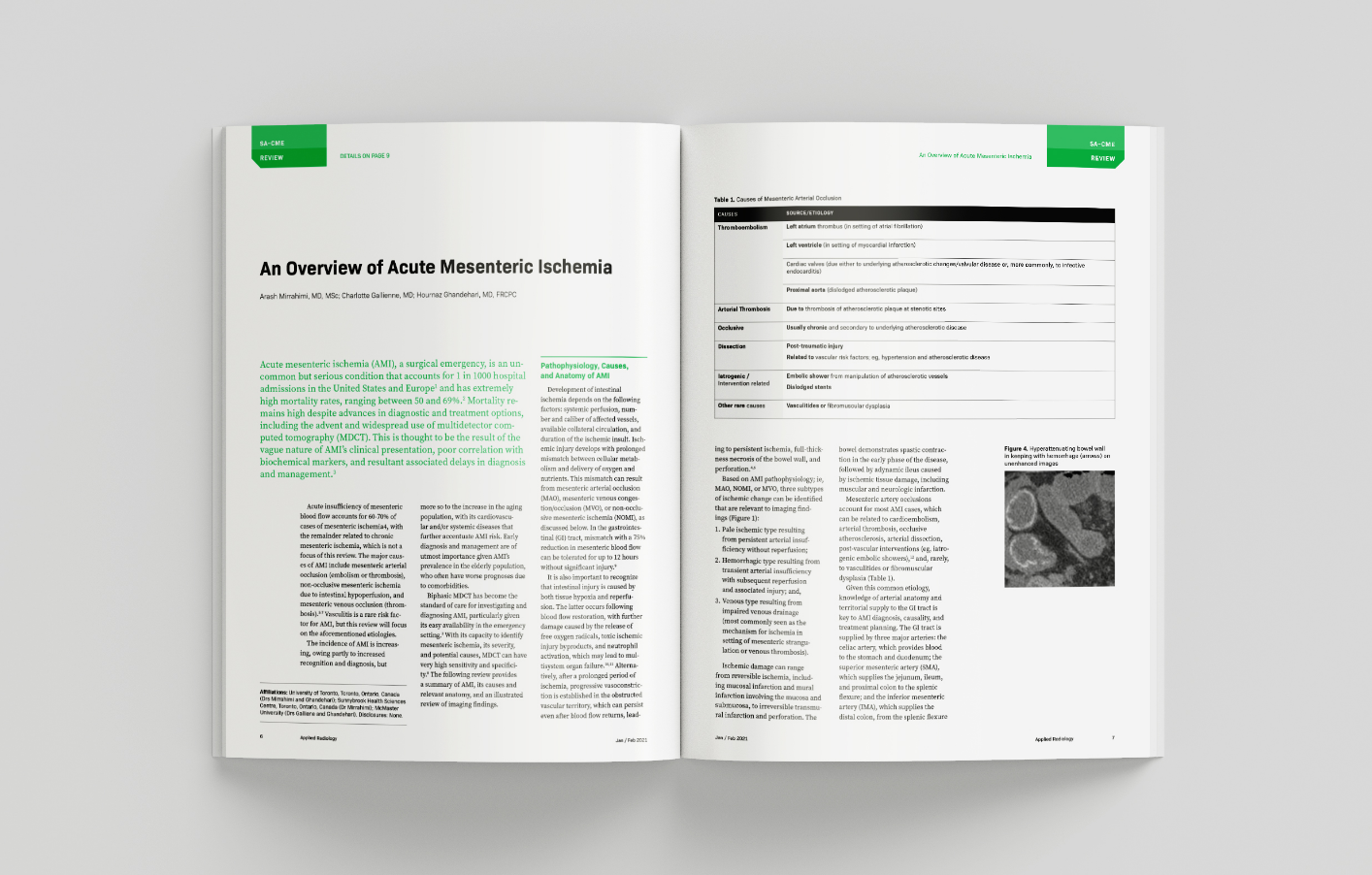
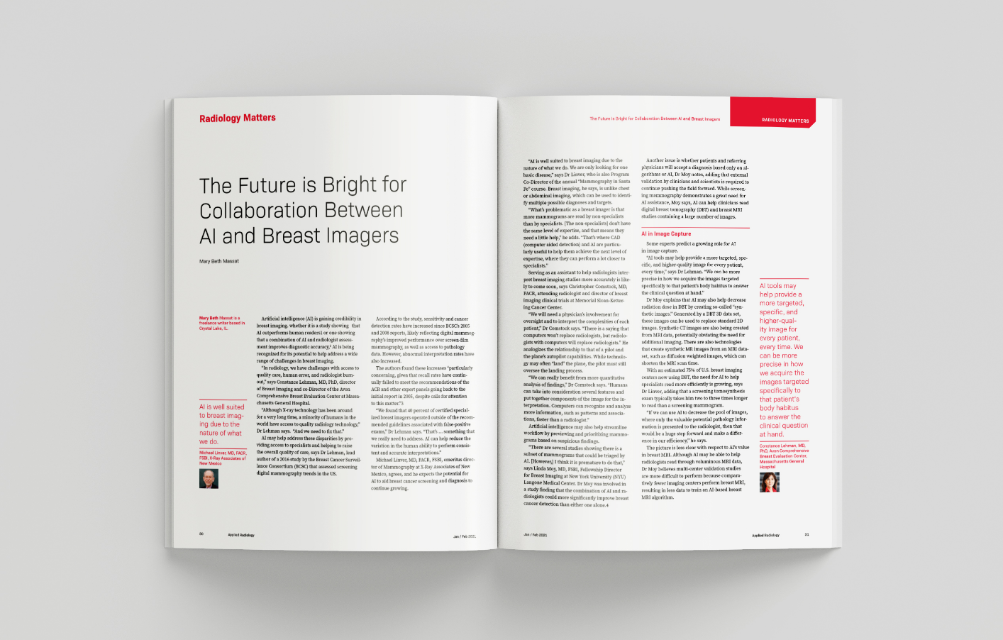
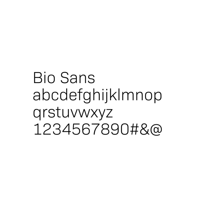
The primary typeface for headlines and large text uses Bio Sans, a neutral sans-serif that has a subtle geometric quality while maintaining a minimal and clean feel. Legibility was a key factor in the type choice, so the large x-height made for high readability in both print and on screen.

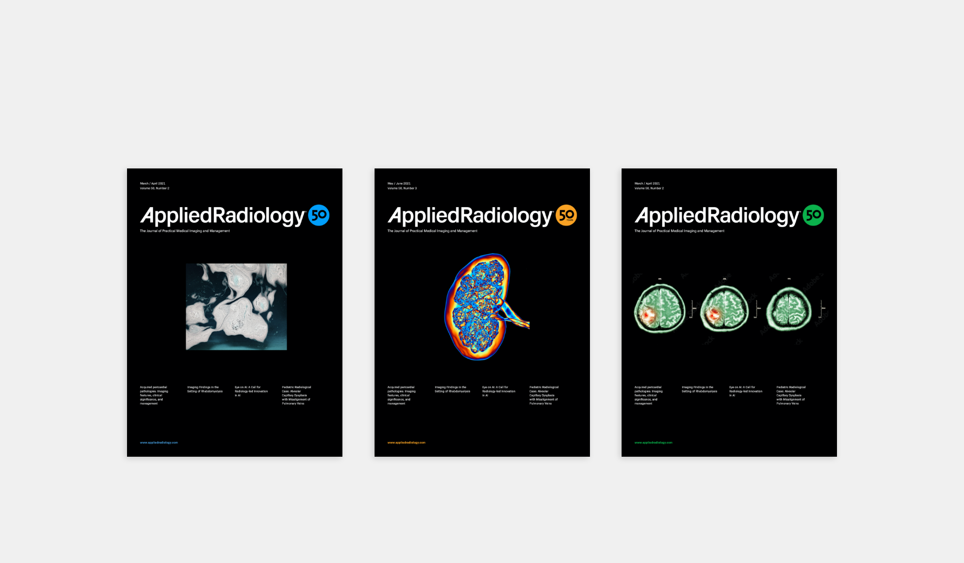
The publication covers feature a graphic image centered on black. Text is kept to a minimum, to allow the image to shine.
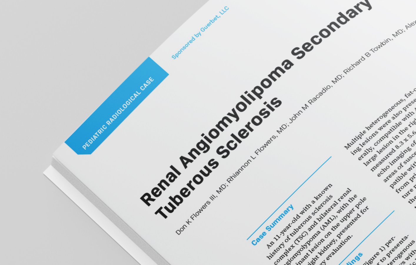
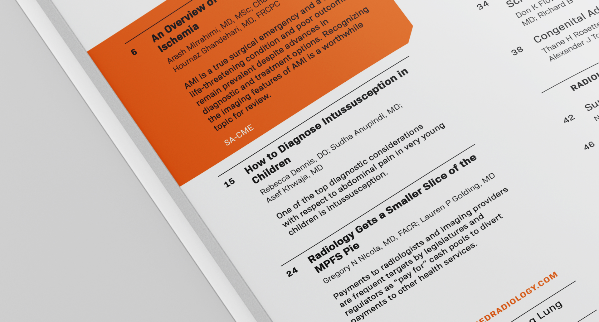
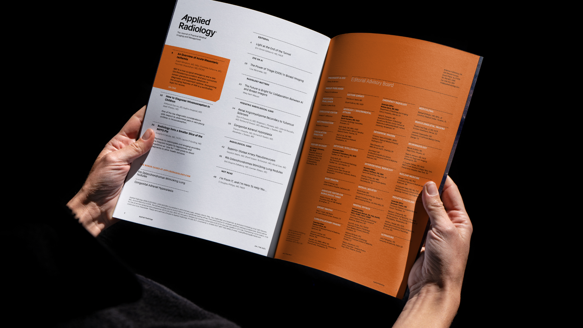
Sections are distinguished by color, making it easy for busy readers to find information that’s relevant and useful to them.
